Don’t Waste the Picture Space on Your LinkedIn Company Page
If you haven’t looked at the Company Page layout on LinkedIn for a while, now would be a good time. There have been some major changes, all – to my mind – for the good.
For a quick introduction to setting up a Company Page on LinkedIn, check out my post on the MYOB blog LinkedIn 101: Company Pages.
One very significant change is that the About (Your Company) segment has now been pushed to the bottom of the page.
That’s a good reason to put some imagination and effort into how you use the new, large image option for the top of the page. Otherwise the first thing your visitor will notice is your latest update, which may not be what you want people to see first about your company.
Don’t waste the space with just a pretty picture.
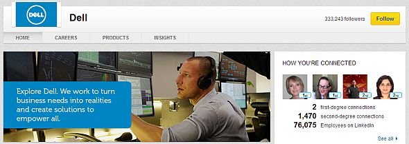
With the image you can tell an “instant story” about your company, possibly more effectively than with a couple of paragraphs of words. See for example how Dell and HP have each used the image option at the top of the Overview (Home) view to communicate something about their company and its approach.
Image dimensions
The image should be measured precisely at 646 pixels wide by 220 pixels high.
If it doesn’t meet those dimensions, the LinkedIn engine will crop the image and I can assure you from my own experience that the results may not be pretty. (Note that LinkedIn may at some stage change the dimensions and in fact I have seen pages where the image is much wider, but 646px x 220px is the size currently indicated in the edit screen on my company page.)
Tips for Economy
Speaking of prettiness, the image does not have to be fancy or cost a lot of money.
The key thing is to use the image to make a point of some kind about your company. Someone with basic skills in Photoshop or similar could surely whip something up for you to at least get you started. And if you want to swap the picture out for a different one at any time you can do that.
If you don’t have Photoshop or Photoshop Elements, there are more moderately priced or free options.
Share Examples
So far, I haven’t found a great number of company pages on LinkedIn to hold up as examples. Even some big multinational companies don’t seem to have bothered going beyond just establishing a basic page. Others, like Dell and HP as illustrated above, have seized the opportunity for brand promotion.
What about you and your company or brand?
If you know of other company pages where the image has been customized to better promote the company, please share the link here. That can include your own company site, of course!
Des Walsh
Business coach and digital entrepreneur. With coach training from Coachville.com and its Graduate School of Coaching, and a founding member of the International Association of Coaching, Des has been coaching business owners and entrepreneurs for the past 20 years. Over the same period he has also been actively engaged in promoting the business opportunities of the digital economy. He is a certified Neurolinguistic Programming (NLP) coach, and a certified specialist in social media strategy and affiliate marketing.


One Comment
Comments are closed.